Building this site
March 6, 2023
This website is small and simple. It may even be unimpressive. But it’s the product of several weeks of extracurricular planning and problem solving. I’m a little bit proud of it, and I’d like to spend a few hundred words explaining how it came together.
Background
This winter, I found myself wanting a dedicated place to represent and express myself online. I’d fallen deeply out of love with feed-based social media, and I was longing for a low-stakes way to practice and publish a few crafts without layers of social metrics distracting me from the joy of creation. In short, I really missed what we might call The Old Web: pages, hyperlinks, stupid personal blogs with fewer than 100 monthly visits.
Conveniently, through work, I’d recently become aware of a new class of web development technologies like Next.js, Remix, and SvelteKit. Through that exposure, I began to understand that the world of web dev has in many ways come full circle from its origins in static file hosting, to the event-loop mania of systems like React, through a brief pit-stop in runtime server-side rendering, to a new adoption of edge-hosted static (or lightweight server-abetted) sites. With that knowledge slowly gaining more weight in my mind, it became harder for me not to think about what I would want to use it for.
When that urge to create finally boiled over, I tried something that’s very against my nature: I channeled the energy into conceptualization instead of immediately building things. One of the things I love most about my job is how much I get to learn, explicitly and through osmosis, about disciplines I don’t actively practice, such as product and visual design. It was this informal education that caused me to jumped not into a code editor when it came time to build a site, but into (gasp! shock! terror!) Figma.
Research and design
Partially because it made me feel like a professional, and partially because I wanted to learn from the experience of running a “real” design process, I tried my best to kick off the project with some light research. I reviewed a number of websites belonging to creative professionals or companies that I’m fond of, and took some simple notes on what stood out to me from each one.
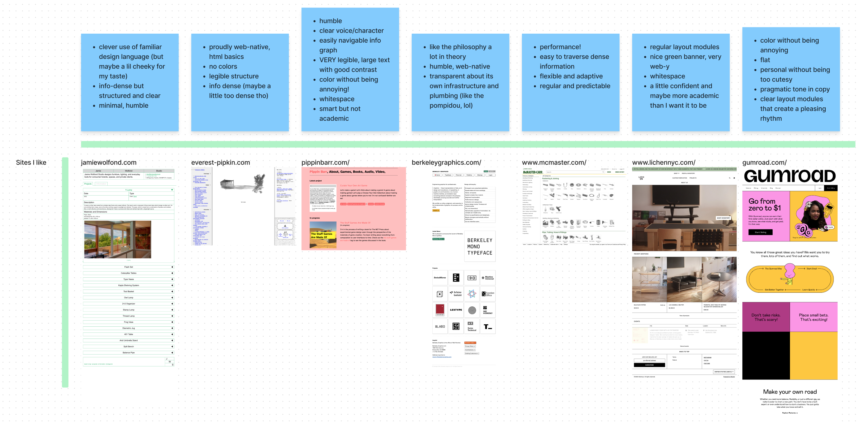
A few obvious themes emerged: I appreciated flat design languages, I liked simple an unadorned layouts, and I really enjoyed interacting with sites that had straightforward and transparent navigational logic. I also noticed that I liked it much better when a site’s personality came through naturally, without feeling forced or cheeky.
With a burgeoning languge for what I liked and didn’t like, a few educational articles under my belt, and a weekend without plans in front of me, I set to work on building a design system for my new site. In hindsight, this process came down to solving two slightly different problems: crafting a visual design system, and describing a functional design philosophy. In other words, I wanted to have a strong understanding of the formal building blocks that I would use to lay out my site, but I also needed a set of principles to guide how people could interact with it.
Making a design system
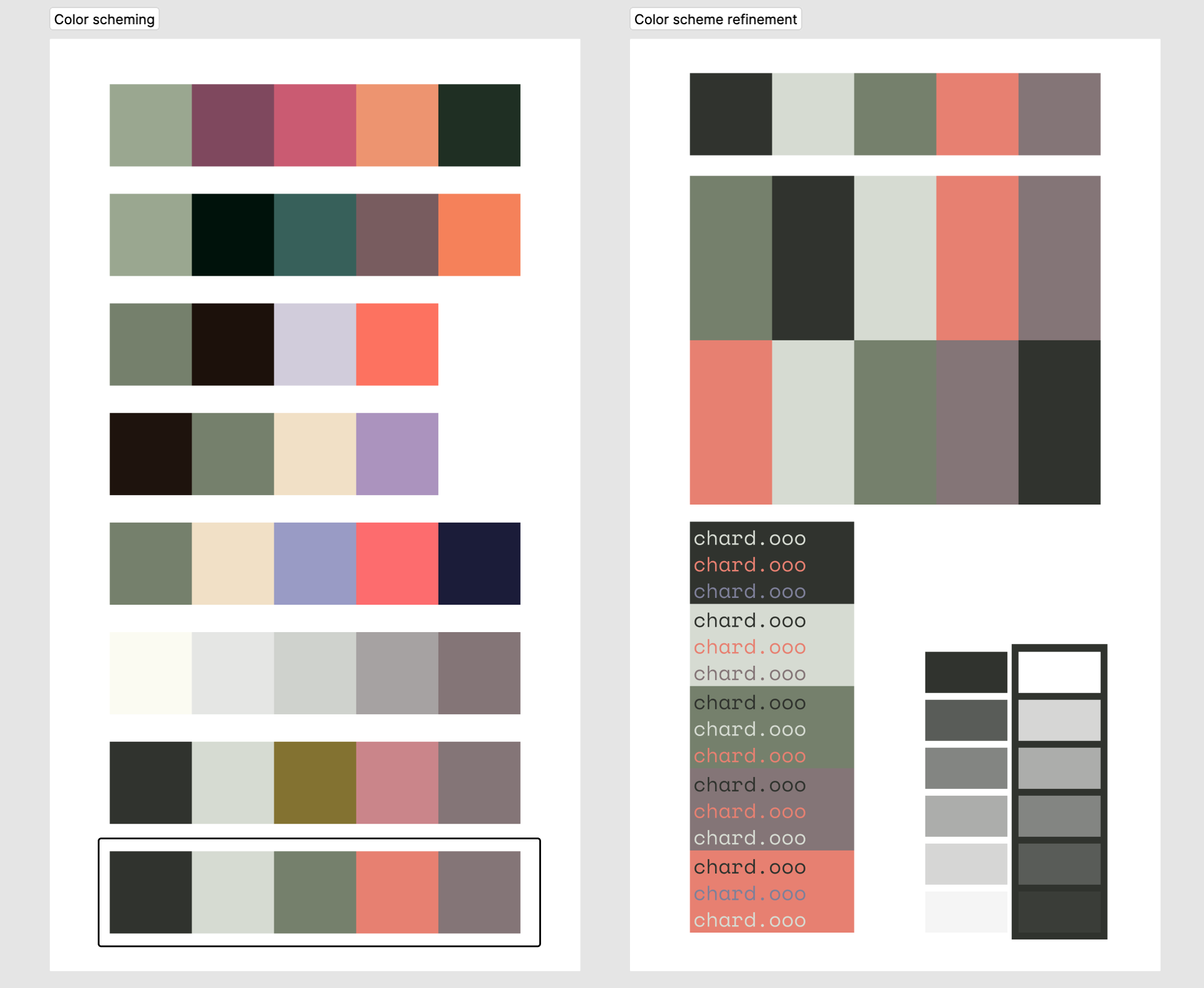
The first problem mostly broke down into choosing systems for colors and typography. I explored a variety of muted color schemes mostly built around a core set of earthy greens, rich deep colors, and what I hoped were non-traditional off-whites.
On the type side, I played with a few serifs and monospaced fonts until I found one I adored, one that I was positive I could build a site around: a beautiful, expressive monospace family called IBM Plex. And then I realized that someone already has built an entire brand around it—IBM. Oops! Tail between my legs, I scurried back to Google Fonts until I happened upon a neat little duo in Space Mono and Space Grotesk.
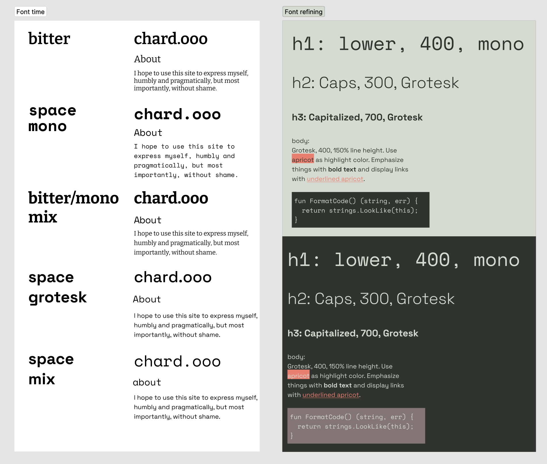
Throughout and after this research process, landing on an initial design system was primarily a matter of playing around in Figma and tinkering until things just felt right. Eventually I managed to put together the above artifacts that felt good enough to start building on—my work as a software engineer has taught me to never plan past ~80% certainty, since a lot of constraints and opportunities tend to reveal themselves “in the field,” as it were. If you look closely, you’ll notice that some of my typography choices in particular didn’t end up making the cut, because I didn’t end up liking them once they were under my mouse.
Principles for interaction
If making a design system meant learning how to color within the lines, the experiential design was where I felt way more comfortable flexing my own creative instincts. Combining what I learned from researching other personal or portfolio sites with a few areas of interaction design that have been interesting to me as of late, I began by laying out a few high-level principles that I wanted to use as a sort of framework. My hope was to create a set of core values that I could use to answer whatever small design questions may arise. Here’s what I landed on:
- Flatness: the site should minimize hierarchy and avoid real-world metaphors
- Pragmatism: the site should minimize ornament and should not draw undue attention to itself
- Transparency: the site should encourage me to share whatever I make in whatever state it may be in, and should not overly obfuscate the technology that powers it
Now that I had a philosophy I could use to make decisions, I could start thinking more concretely about the site’s core primitives, the nouns and verbs that would define how a person might interact with it. The principle of flatness in particular got under my skin, driving me to reduce the site’s functionality to the bare minimum, until I felt that there were as few dimensions of exploration as possible. And so I now think of my site’s functionality as a combination of a few simple sentences:
Everything on the site is a post. Posts have tags. Posts can be filtered by tag.
That’s it. That’s the whole damn site. Throw in a couple other simple ideas that matter to me (keyboard navigation, honest URLs), and it should be pretty easy to see how I landed on the design you see today.
Development and deployment
While I had plenty of lofty design goals for this site, I’d be lying if I didn’t want to use it as an opportunity for my own edification as well. So even though I felt it was important not to go down a technical rabbit hole, I also felt fairly certain that I didn’t want to build it with web frameworks I was already familiar with, like React or Next.js. After some cursory research, it seemed like SvelteKit was just about the perfect solution: its compiler allows (even encourages!) you to write plain HTML, CSS, and JS while staying almost entirely out of your way. There’s a bit more magic to it than I usually like (directory structure as a way of encoding application logic stresses me out), but it’s altogether very intuitive, and my experience with early prototypes was quite delightful.
With that decision out of the way, I still had to figure out the details of building this site, in all its hybrid blog/portfolio/process-notes glory. Luckily, this goober published a pretty complete blueprint, and I had to make just about 0 interesting decisions through my development process. I could let tools like Svelte, SvelteKit, and MDSveX do the heavy lifting, so that I could focus on the few custom elements I cared about, like scripting up keyboard nagivation, the tag navigator in the bottom left of your screen (on desktop), and writing my first few posts.
I may share a bit more detail about the input handlers that I wrote for keyboard navigation, and their limitations, in the future. But for now, I’ll keep code out of this post and get on with the final bit: deployment. We live in a weird world, where there’s no shortage of platforms practically begging to host your site for free: Netlify, GitHub, Cloudflare, Vercel, Render, and likely plenty of others. Whenever I’m faced with what I like to call a “toothpaste aisle decision,” where I have to choose among a large number of completely undifferentiated products, I tend to freeze up. I’ve learned that more often than not, I benefit from just asking someone else to pick for me. Luckily, my friend Alex happens to be a fanboy of Cloudflare, which means I could put another arbitrary decision in my past.
So I bought a domain, registered it with Cloudflare Pages, wired up SvelteKit’s Cloudflare Pages adapter, clicked one or two more buttons, pushed my code to main, and had a website on the Real Internet. I am very pleased to report that it really is that easy.
Epilogue: what’s left to do
What I like best about where I’ve landed is that I’m very happy with it but still see plenty of room for improvement. Obviously my plans for future development will depend on whether I get any feedback, how much time I have, and what happens to catch my fancy.
But I can already see a few things I’d like to flesh out or revisit:
Post notifications
I think it should be possible to build an RSS feed from my posts list as part of the deployment process. This RSS feed could then be consumed by things like Zapier or IFTTT to send email or SMS notifications to whatever nutjobs might care about all of my posts. In theory I could even allow different notification settings per tag or allow for user logins to manage subscription settings.
More readably page content
I’m very skeptical of sans-serif fonts for body text. My eyes tend to slip right off their rounded edges, making me squint to read more than a few sentences at a time. On principle, I like that there’s a shared lineage between my header and body fonts. But in practice, I’m not sure Space Grotesk will last very long here before I retreat to the comforting embrace of something like Bitter.
Search, pagination, performance, oh my
Simplicity is the name of the game for now: I’m not worrying at all about how my site manages displaying or sorting my posts en masse. But at a certain point, I may need to give some serious thought to ensuring that my site’s homepage stays snappy, that visitors can find specific posts, and that I don’t accidentally rack up a ridiculous Cloudflare bill.
Types, oh god, please, types
I lose sleep over untyped languages, and I adore a helpful compiler. Unfortunately, I couldn’t quite figure out how to get Svelte and TypeScript to play nicely with each other. I wish I’d spent another hour or two on that before writing almost my entire site in vanilla, unsafe, reckless JS. Oh well, a problem for another day.